Archive for the ‘ Examples ’ Category

Examples of excise

Example 1: Remember my choices

In Blackboard, every time I upload a new file, I pick the option for it to open in a new tab. Blackboard does not remember this choice so I have to go through that extra click every single time.

In WordPress, I have the same option for links – I have to make that choice once per blog post, and after that, WordPress remembers my preference.

Blackboard doesn't remember preferences

Blackboard doesn’t remember preferences


Example 2: Don’t make me fill out the same information twice.

This example is from WhiteHouse.gov, where I just signed a petition to make the code for Healthcare.gov open source , but it is true of most sites I have seen. You try to log in. You put in your username but forgot the password. You click the “Forgot password?” link to reset your password. In the next screen, you need to input your username AGAIN – why not repopulate it with the information I just input a second ago???!!

Have to re-enter username...

Have to re-enter username…

Can you see how these are examples of excise? What other questions do you have about excise? Please interact with this post as soon as you read it by commenting or rating. Keep in mind that interacting with blog posts is part of your participation grade in this course.

Design principle: mapping

Please see this excellent illustration of mapping, a design principle you read about in Ch. 1 of “the Design of Everyday Things.”

Do you have other examples of mapping you can link to or provide on your blog?

UX & customer relations

Interesting example of how Blue Jeans turned a bad user experience around with excellent customer interaction. Illustrates the point the book chapter made about marketing being part of UX. What do you think?

twitter conversation between me and Blue Jean customer rep

Clickability – again!

I haven’t gotten many ideas on the question of redesigning the ATM buttons – too bad, I thought it was an interesting challenge. Maybe you’ve posted ideas on your blogs and I haven’t seen them yet?

Here is another bad example, on the same basic issue of communicating the affordance of clickability. I guess it’s more of a rant than an example, since it is so obviously wrong and the solution is so simple. Interesting to note, however, how something so simple and easy (can I click this or not?) is still a source of so many errors.

How do you think this works, in Blackboard Learn? What do I have to do to download the assignments? How would you fix this?

OK, but how do I download the files?! Where do I click?!

I hope the examples I post serve to remind you to post your own examples. And reading reflections. And RAAs.

Where do I press??!!

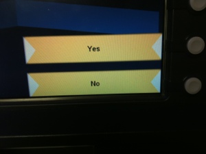
Where do I press to operate this thing? What is your guess?

20121025-195441.jpg
P.S. have you posted a good/bad example this week?

Bad example: oversight in Posterous interface

This is a bit too obvious of an error to be more than an oversight (I hope).

I’ve been using group blogging on Posterous for a team project and it’s been working very well. Today, I wanted to create a new group blog (“space” in Posterous lingo) and I saw this menu on the right side of my “Manage your spaces” page.

The cursor changes to a pointed finger on mouseover on both the black and the white parts communicating the affordance of clickability. This left me to wonder what is the difference between the two options. Turns out there is none. Clicking the black part causes no action. Clicking the white part opens the new space creation dialog.

After some thinking, I figure out the black part must be a heading. Clearly unnecessary. It made me think. It made me click around and think some more to try to figure out what’s what. It communicated clickability when there was none.

This example is so obvious that I am afraid it is not educational enough – it is more of a rant. Thank you for bearing with me.

I am sure that the people at Posterous know these principles. I wonder why they did not notice. What do you think a design team should do to ensure that no such oversights happen?


Interesting visual illusion

This is one of the best (and freakiest) visual illusions I have seen.

Visual illusions point out the role your mind plays in interpreting visual stimuli. Here, it is not the eyes that influence what you see. It is the mind not being able to settle on an interpretation.

We discussed this point earlier in the semester, about the important role the mind plays in visual perception.

Just for fun: Gaming lizard

Feline-computer interaction researcher may be my dream job, but apparently other species enjoy video games, too!

Example – the most basic affordance: clickability

One of the most fundamental affordances in interface design is clickability. The design should clearly indicate what is and what is not clickable. For this reason, it is advised to never ever use underlined text on the Web because it looks like a link when it actually isn’t.

As you look at interfaces, note how each item communicates clickability. What about its design lets you know that a word is clickable, that something is a button – but something else is not?

That’s why Jakob Nielsen maintains that links should always be blue and underlined. That’s a bit extreme, and ruffles visual designers’ feathers, but even if links are not blue and underlined, it should be very clear what is and what is not a link.

Take this example from Blackboard learn. How can you tell if something is clickable or not? Can you tell that the words “graduate handbook” are actually a link? How would you change the design to make it absolutely clear that those words are actually a link?

Click image to enlarge

Bad Design: Clickity-click

So, how many times do you think Dr. V clicked today?

Qualtrics Survey Software
[Uploaded with Skitch!]
I was very proud of myself that I had finished adding all 12 students to their respective Qualtrics surveys.
Then I realized that adding their names (in the leftmost column, not visible) doesn’t mean I’ve shared the survey with them. To actually give them any rights, you have to check the box. And the other box. And three more boxes.
So, class:
If Dr. V has to check  five boxes to check for each student
 and there are 12 students in the class,
How many times did Dr. V clickity-clicked today?
I’ve made this mistake before. I’ve had desperate students email me that they can’t make the last-minute edits I required, because even though I thought I’d given them access, I had not (sorry, Quincy!). Stupid me.
Hold on. If the user is stupid again and again, maybe the interface is not well designed? Maybe there could be just one magic box to check to give complete access to a collaborator??!!
P.S. If you click Details, there are 15 or more little check boxes to check. But that makes for harder math, so we’ll keep it for a more advanced course.