This is a much overdue design critique of iOS7. Can’t do that without talking about flat design. The arguments for flat design are convincing:
- it is a backlash against skeumorphism (which I dislike) and a move towards removing unnecessary ornamentation from the screen. But, in all honesty, Nielsen told us about removing unnecessary ornamentation a LONG time ago.
- as users have gained interface literacy, we do not need to make items on screen look like things in real life in order to teach users what they are. This does not mean, however, doing away with clearly communicating affordances.
“The necessity for skeuomorphic cues to guide novice users into the new world of graphical user interfaces faded out as we absorbed more of these conceptual models, eventually rendering cues redundant,” Bruckhoff says. “Skeuomorphism became a differentiator and eye catcher, up to the point where it wasn’t anymore about guiding new users through familiar cues from the real world, but more about grabbing attentions and serving them with eye candy.” See also this explanation of flat design from Wired.
- simplicity is also a major argument for flat design. It has always been an argument for good design and for reducing cognitive load. Keep in mind, however, that simple does not necessarily mean simplistic. It often takes a lot of detail and sophistication to achieve simplicity.
At the same time, it is worth noting that Tufte’s first chapter in his legendary book is titled Escaping Flatland:
“All the worlds (physical, biological, imaginary, human) that we seek to understand are inevitably and happily multivariate in nature,” he writes. “Not flatlands.” – Tufte
Tufte writes about escaping flatland as a way to overcome the limitation of 2 dimensions in order to communicate information more effectively. An obsession with flatness for the sake of flatness is not beneficial. We should instead be obsessed with whatever is useful and usable. However, this is not argument agains flat design. It is a commentary on how flat design is implemented in iOS7. I organize it around main issues in interface usability:
Affordance
The most basic affordance on the screen is clickability. It should be clear what is and what is not clickable. Users should not have to think about that.
I remember coming across screens in iOS7 where it wasn’t entirely clear what is and what is not clickable. Unfortunately, I didn’t take a screenshot at the time and now I can’t remember what screen it was. I will update this post as soon as I come across it.
Reading
Reading is hard and unnatural. Shape recognition is much faster and efficient for the human mind than reading. iOS7 relies too much on reading. For example, when the timer is done (if it’s been running long enough for the screen to go to sleep) it shows the following screen:
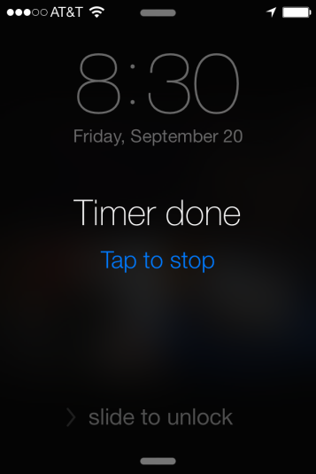
Operating it relies entirely on reading the blue text on black background. It is much more time consuming than recognizing a shape and the affordance it communicates (tapping or sliding). Also, it is hard to operate if you have removed your glasses!
The same applies to the “slide to unlock” text at the bottom of the screen. Without understanding the text, the affordance is not communicated clearly, like in the previous design, where the button showed an arrow for direction and the path it could slide on was visible.
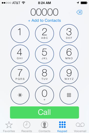
The same issue appears in the phone answering screen, where the affordance suggested by the green shape (button: tapping) is in direct contradiction with the text instructions. Again, this cannot be operated if you do not understand the text. Of course, we learn after a while, but we have learned to put up with all sorts of horrible interfaces, so that is not the point.
I find it ironic (and sad) that for a company whose products where famous for the fact that you did not need instructions to use them, the current design relies so heavily on text instructions.

Learnability
Learning is hard. If you make people learn something new, make sure you have a good solid reason for that. Changes should be revolutionary, or at least significant improvements, not just cosmetic. I see a lot of changes in iOS7 that are cosmetic, not revolutionary. One example is the sounds. Granted, the new sounds are more pleasant and communicate less urgency than the ones in previous versions. But, having been trained better than Pavlov’s dog to recognize calendar invites and alerts, it bugs me that now my phone makes a sound and I have no idea what it is. I know, this old dog will learn a new trick, but why make users learn if it’s not completely necessary? It is best to capitalize on things we have already learned – this is what makes interfaces appear “intuitive,” rather than make us learn again, unless there’s good reason for that.
Many changes are, I think, gimmicks, because they are not significant improvements of the interface. For example, swiping to delete items only works one way now, so the muscle memory we have is useless. Also, the cell signal bars are now bubbles – which can cause confusion with the bubbles at the bottom of the screen, the ones that tell you what screen you’re on. Why violate highly accepted and common standards of how to represent cell phone signal strength? Are bubbles really an improvement over bars?
I am not sure this belongs here, but why mess with a simple learned behavior like scrolling? I hate “natural scrolling” and I keep it off on my Mac, but now, when I scroll, I often open the command center by accident. All these accidents are signs of usability issues.
Consistency
Following accepted standards and being consistent with them and within the design is one of Nielsen’s 10 heuristics. I mentioned above the cell signal bubbles. Here are some other examples:
Color inconsistency
The icons on the chrome in timer are red. On the phone, they are blue. We could argue that this serves the purpose of indicating where we are – phone, or timer? Given that there are already major differences between the two, it is not necessary to indicate place with color. Also, given that red is such an important color that communicates errors and urgency, this is not an efficient way of color coding to distinguish what iOS app we are in. Also, the calendar’s commands are red, too, so the hypothesis about location indicator breaks down.
Size inconsistency
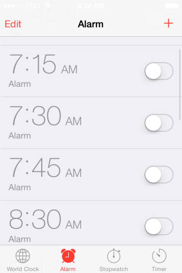
Another inconsistency is that of size. Some characters are really large – such as the ones used in setting the alarm; but others are really small now – such as the ones used in setting the timer. I don’t have particularly large fingers, but I often make mistakes when using the redesigned scroll wheel control.
This is in direct violation of Fitts’ law, which states that:
The time to acquire a target is a function of the distance to and size of the target.
Basically, if the target is too small, or too far away, it takes longer to reach it.

I believe the size of the rows for tapping on email accounts was also reduced, and I often encounter errors there, too (I tap a different account than I intended to). This didn’t happen before.

Focus on content
One of Tufte’s main principles of visual information display is to focus on content and fade visual information (such as table lines) that are not related to content. Also, Tufte warns about the unintended patterns these other elements might create, which in turn obscure the meaning of content.
This is the principle that is violated by the phone pad. The circles around the numbers are so saturated that they compete for visual attention with the actual numbers.
Aesthetics
Last but not least, aesthetics is a function of usability – and certainly of user experience. You could argue that this is a matter of taste, but there are also well-known guidelines related to proportion and the use of color that predict satisfaction with aesthetics.
If you know me, you know I love minimalism and modern designs (visit my living room if you have to!). However, simplicity is not the same thing as simplistic. Look at the commands below: They are very large, our of proportion with the rest of the screen, and they are simplistic, not simple. They must have taken all of 30 seconds to create. I am amazed that someone actually got PAID to create those, or the table headings on the calendar.

I am afraid that this tweet from Tog (who worked at Apple for a while, and who is an amazing mind – research and follow his writing online) sums up what has happened here:
P.S.
Since I started working on this post Nielsen has come up with his review of iOS7. I haven’t read it yet, because I didn’t want it to influence this review. In fact, I intentionally have not read reviews of the iOS7 UI. Had I done so, I am sure this post would be more complete (and even longer!). Can’t wait to see what others have to say!


 CGT 512