Posts Tagged ‘ metaphor ’

Class notes F14 – Week 4: Fundamental principles part 2 of 3

We moved from visual perception and attention to issues related to cognition – specifically, memory and learning.

It should be clear by now that largely, what makes an interface intuitive is its ease of learning. The following concepts are important when it comes to ease of learning:

Here’s Don Norman explaining affordances in less than 2 minutes:

All these things we know about visual perception and cognition are at the root of most guidelines for usable interface design. One of the most famous set of guidelines is Nielsen’s 10 heuristics, which we worked with in class. These heuristics can be used to inspect interfaces in a method called heuristic evaluation, which you will read about for next class.

Please remember to let me know that you read this post by interacting with it somehow. This, as well as participation on the FB group, are requirements for class participation.

Class notes: Sketches and Wireframes

I started class today with a few announcements:

  1. If you are serious about learning more in the area of HCI, there is a course at Purdue, IE/PSYCH 577  Human Factors in Engineering (Purdue Catalog description) that covers in depth the topics we mentioned in the presentations about “Designing with the Mind in Mind.” It is taught by Dr. Robert Proctor, a legend in the field of human factors. If you have or are taking that course and can comment on its utility for students interested in user-centered design, please do so below.
  2. I’ve been contacted by someone who will pay a student to develop an Android app – email me if you want more details.

As we got to work, I wanted to clarify the concept of affordance and what an important role the body plays in seeing affordances in the physical world. I illustrated this with the slides below which show the difference in perceived affordances of common objects between humans and cats.

In the digital world, affordances are often communicated by making references to objects from the physical world. This is the concept of metaphor (this is the website I showed in class). However, metaphors have disadvantages when they impose the limitations of the physical world onto the digital one. Also, when taken too far, metaphors lead to skeumorphism, which is a tacky and outdated idea. We also discussed how metaphors can be outdated and become meaningless.

Next, we talked about using grid systems for alignment. The point is to limit the number of vertical alignments on a page. This will help you organize information better. This is the website I showed in class, where you can show and hide the grid on demand. I also recommend the book Making and Breaking the Grid.

Also, remember visual hierarchy. You can use size, color, shape, or texture contrast to make an object stand out and make it the first thing people look at. To assess visual hierarchy, use this simple test:

  • close your eyes
  • look at the screen and notice: what do you see first, second, third?
  • note what design elements are used to lead your eye from #1 to #2 and on.

Below are the slides on visual hierarchy I use in my undergraduate course.

Last, I mentioned typography – more about it in this other blog post.

A graphic design course can help you learn more about these things. As a user experience designer, if you know visual design, that is wonderful. You might be a UX unicorn! But if you are not a visual artist, you should at least be able to talk about these things intelligently.

You do need to know at least grids and visual hierarchy to create wireframes – for mockups, you do need a visual designer!

We spent the rest of class storyboarding a pizza ordering app and creating some wireframes.
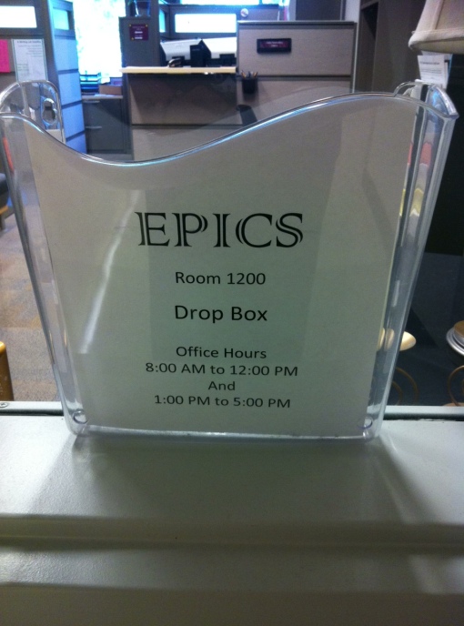
Reverse metaphor: Dropbox


I saw this in a building the other day and thought to myself: Dropbox?! Oh, I know what this is, it works just like the online service Dropbox.

Then, of course, I realized that it’s the other way round.

Dropbox

But there are so many metaphors we use on the screen that have become outdated, because we do not use their physical analogues anymore – floppy disks? paper calendars? tabbed folders?

The metaphors are becoming divorced from the very objects that used to help us understand how they were supposed to help us understand how the computer features work.

They are becoming stand-alone signifiers. We know what “tabs” are even if we’ve never worked with tabbed folders before (imagine explaining to your children where this comes from!).

So, what are we to do? I see 2 options:

  1. Keep the metaphors and use them with their newly acquired meaning. They are not metaphors anymore, they don’t stand for something else. They stand for themselves.
  2. Move away from the metaphors that make reference to physical objects and embrace the digital world for what it is, and create its own language and signifiers. I think this is one of the main pushes behind flat design – it’s a move against one of the most fundamental metaphor, the button.

I agree with this philosophy. I do not like things that pretend to be something they’re not.  They remind me of the cheap plastic bowls that are made to look like grandmother’s expensive china. In the physical world, we call them kitsch.

This doesn’t mean, however, that flat design is without pitfalls. By doing away with metaphor, which has an important role in learnability and communicating affordances, flat design invites usability problems. I guess the devil is in the implementation details – but look at Pinterest. It uses flat design and seems to get EVERYTHING right. So it can be done. 😉